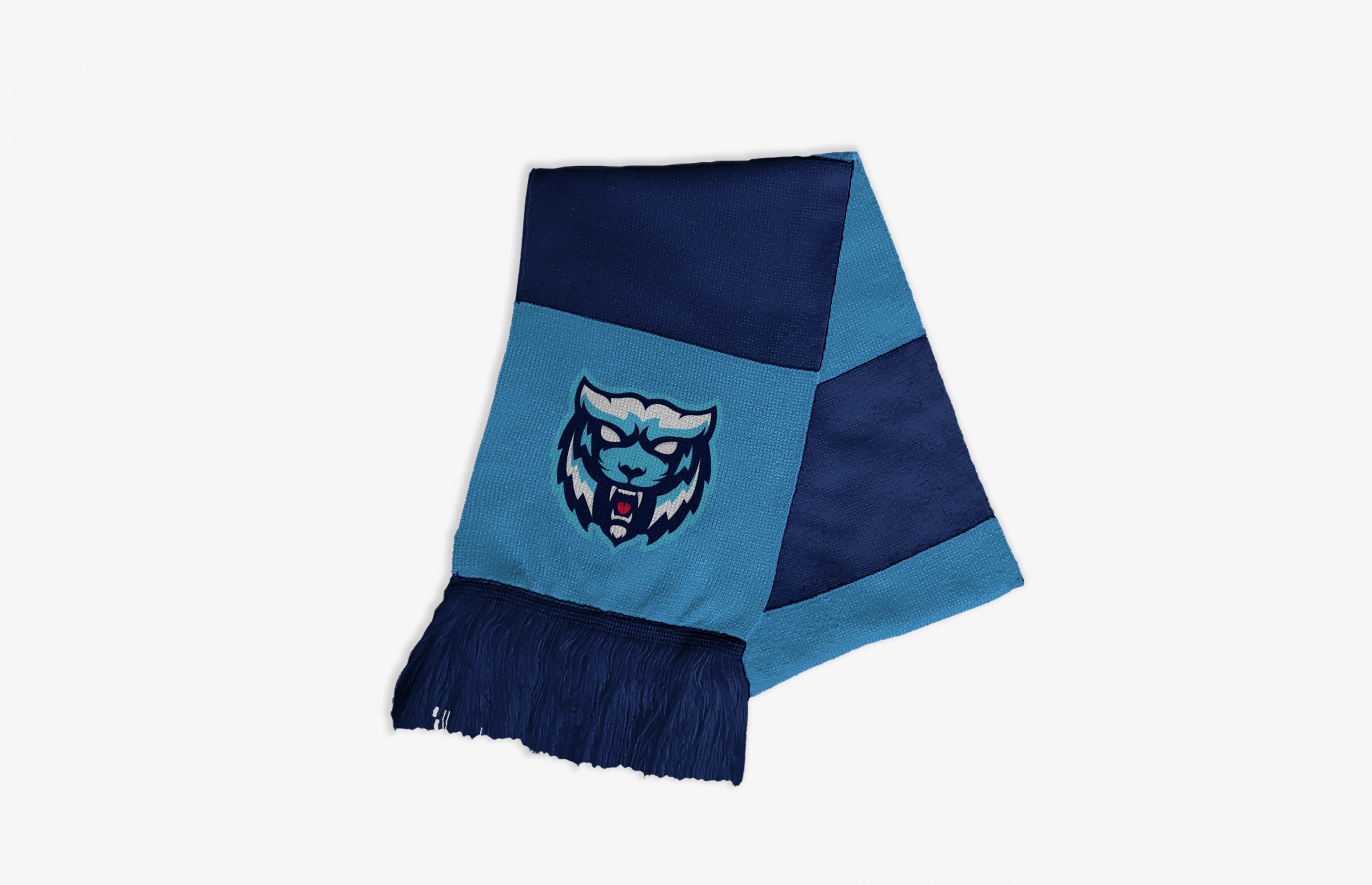
Tigers Hockey
Rebranding a local minor hockey team
CATEGORY
Typography, Print, Copywriting
OVERVIEW
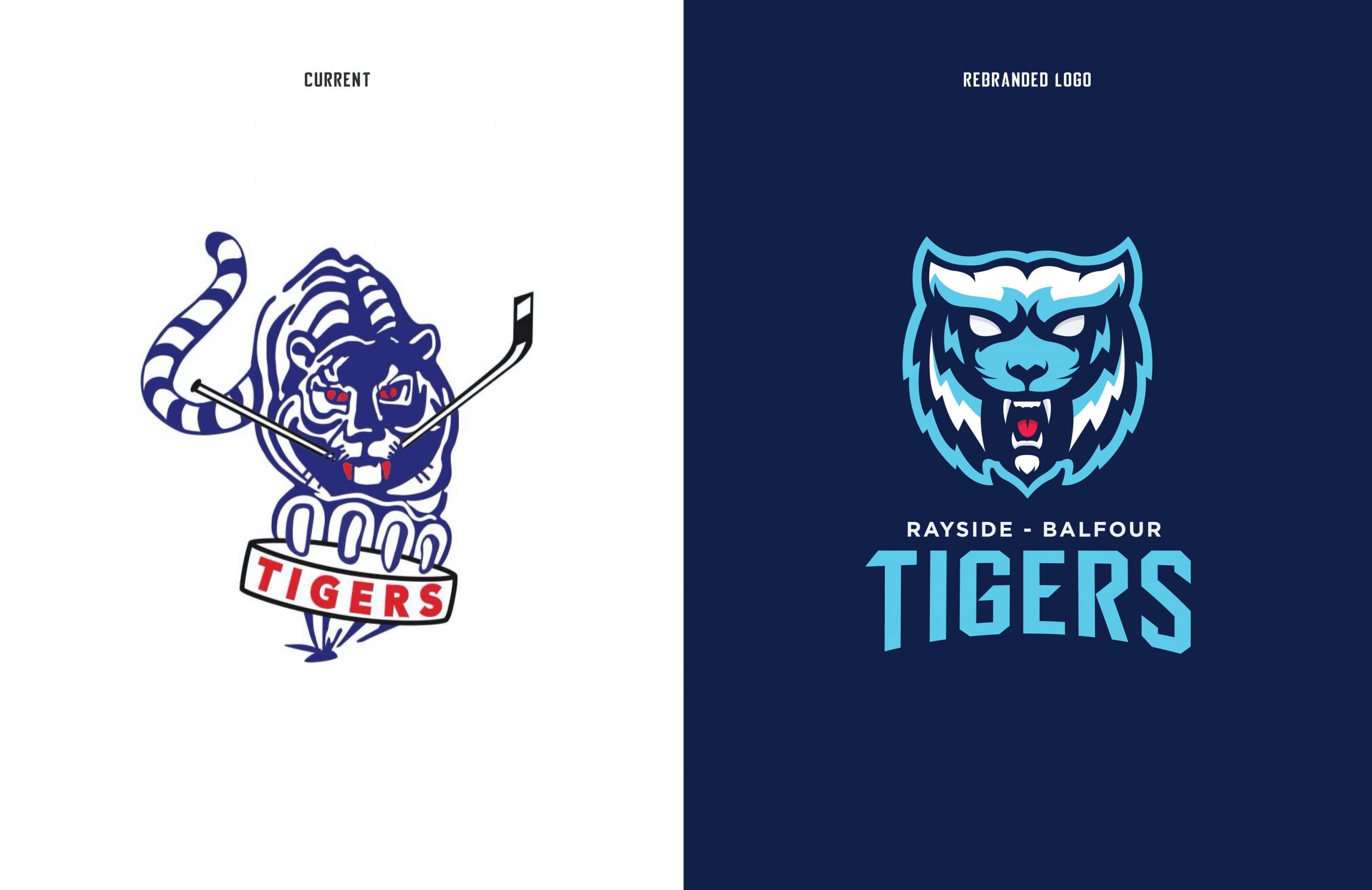
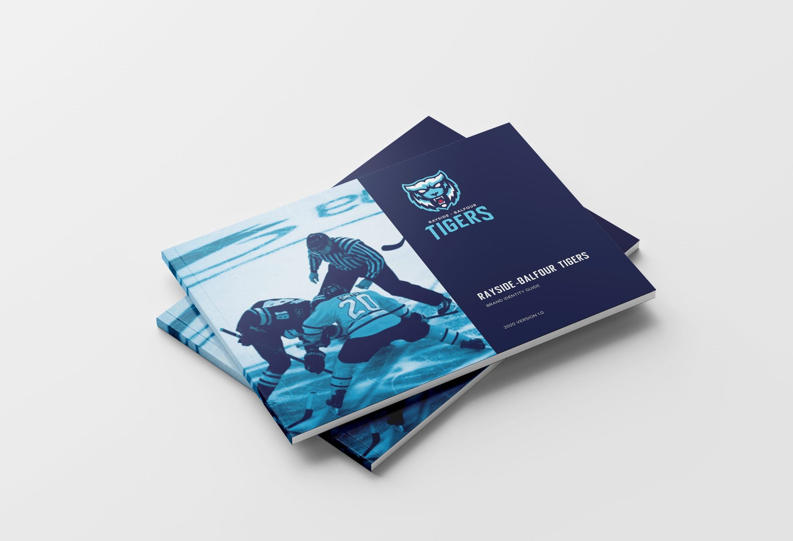
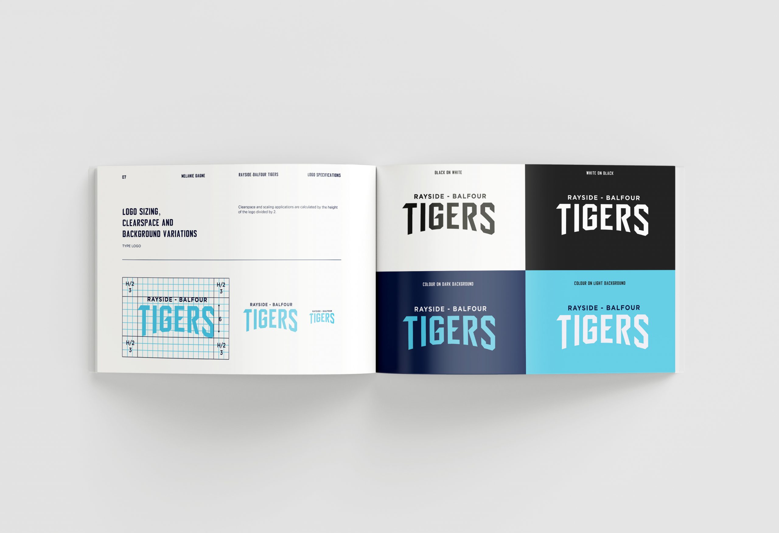
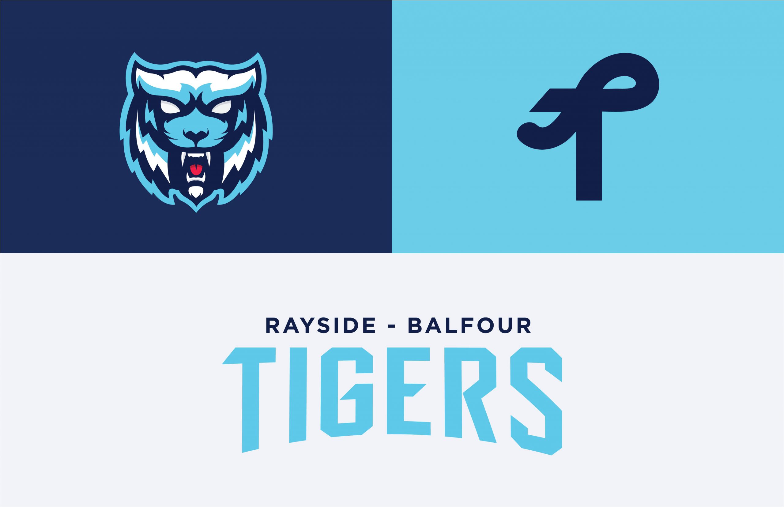
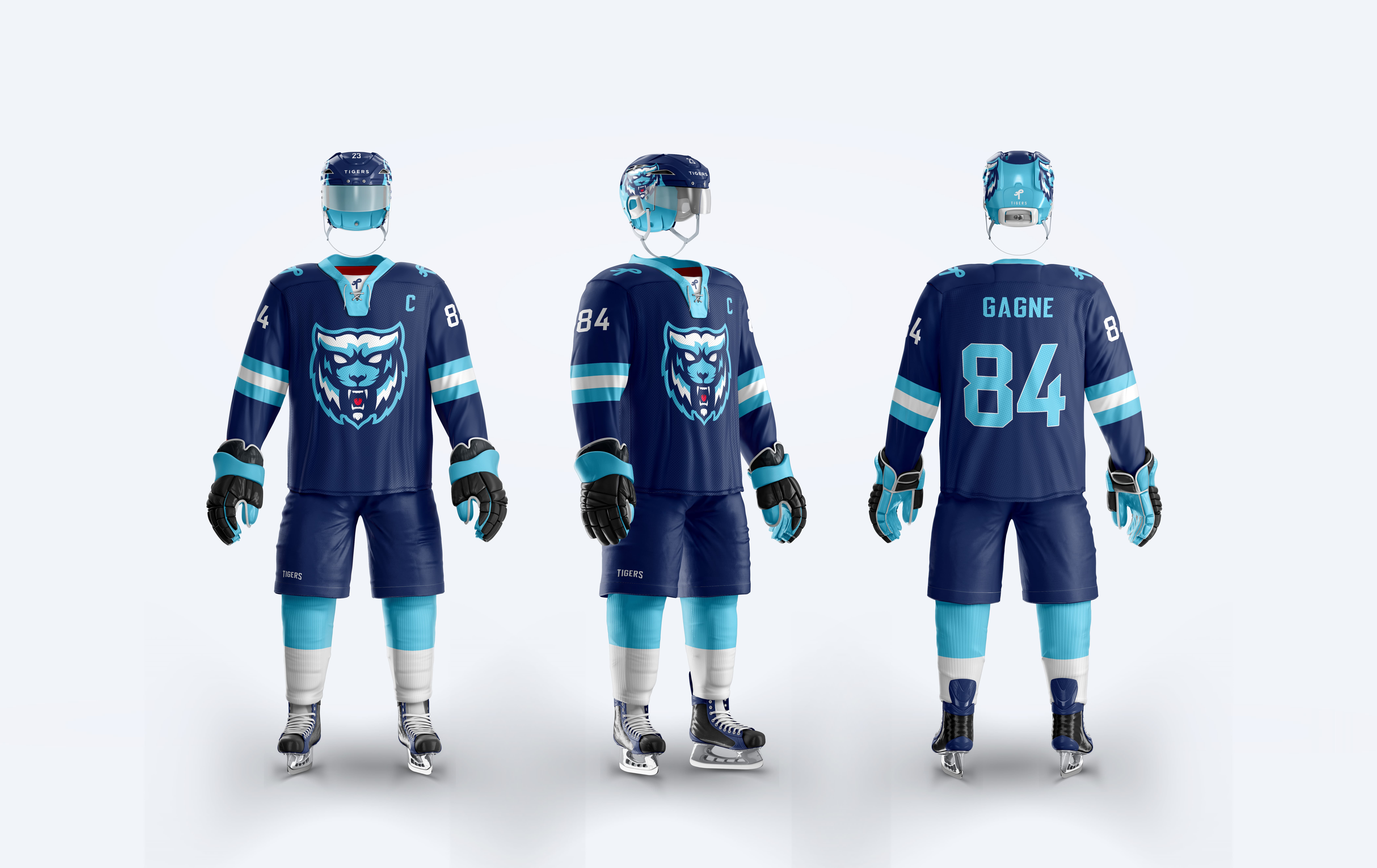
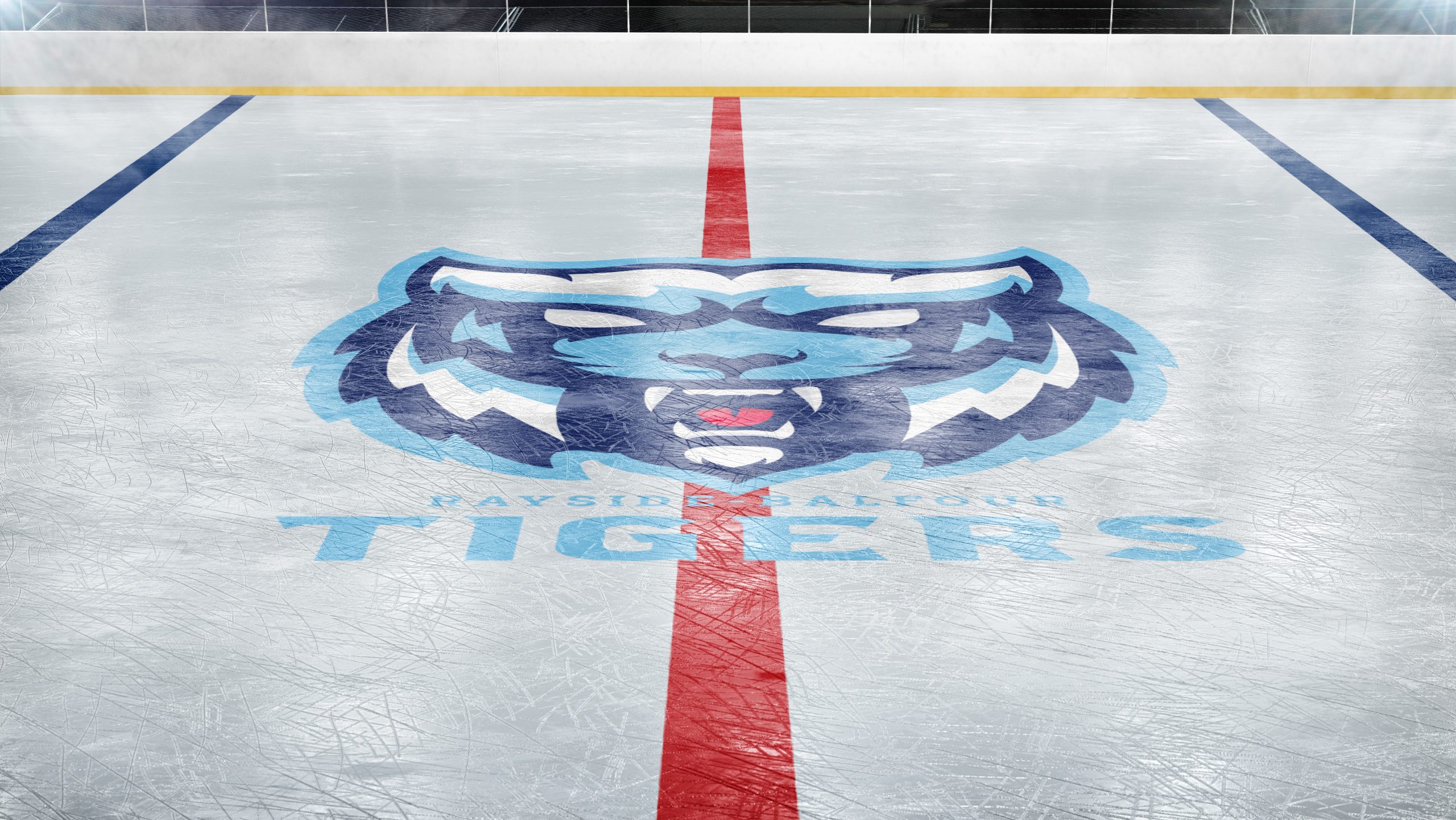
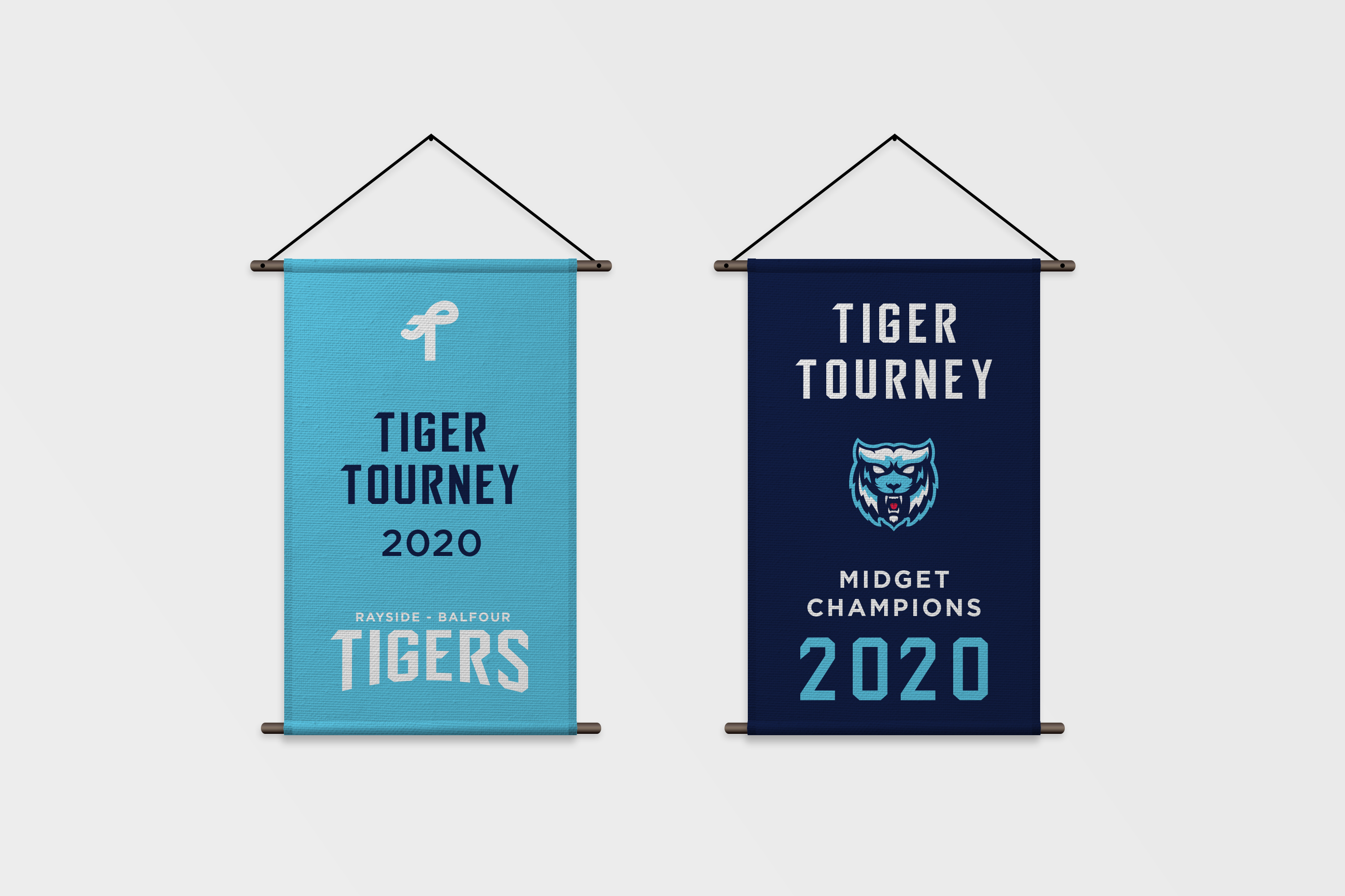
Rayside-Balfour Tiger’s rebrand concept focuses on solving challenges their brand and logo currently experience. Keeping the association’s player age range in mind, I created a standalone tiger portrait with an angular style to communicate strength and confidence without being unduly aggressive. Simplifying the logo and creating alternative elements now allows for effortless and consistent application throughout the wide variety of deliverables like apparel and environmental applications.
